 Here is our first idea for our digipack. Four of the six pictures on the digipack are screenshots from our music video. We then added background colours to go with the album title; "Technicolour". We choose the album title because of the irony it creates because the music video we shot was in black and white. The ablum track titles are stereotypical Brit-indie track names. These were named this way because the genre isn't necessarily known for having deep lyrical meaning which the track titles suggest. In the sixth and final image on the digipack, it shows a band shot.
 Thursday, 20 February 2014
Possible Digipack 1
Here is our first idea for our digipack. Four of the six pictures on the digipack are screenshots from our music video. We then added background colours to go with the album title; "Technicolour". We choose the album title because of the irony it creates because the music video we shot was in black and white. The ablum track titles are stereotypical Brit-indie track names. These were named this way because the genre isn't necessarily known for having deep lyrical meaning which the track titles suggest. In the sixth and final image on the digipack, it shows a band shot. 
Thursday, 13 February 2014
Technicolour Poster

This is the poster we made for the magazine. Again this fits with the "Technicolour" album title as we have a variety of colours on it. The poster is a large version of the album cover which includes made up quotes of large national newspapers in Britain. We created the stereotypical quotes you mainly we mainly see on all CD advertisements, such as; "Best Album of 2014".
Tuesday, 11 February 2014
Possible Band Shot
 This is a possible band shot, the photograph was taken by a white brick wall. The photo was then edited using Photoshop. The colours used on the photo match the colours on the album cover. We used filters to make it stand out more.
This is the second possible band shot. The difference is that we aren't stood up against a white brick wall. This time we are stood in an alleyway. The image has been cropped slightly we decided to take out the tree and the sky as we felt these weren't needed.
After reviewing both band shots, I've decided that I like them both. They both fit in with the criteria which is used for the Brit indie image. The colours also tie in with the album title "Technicolour".
Monday, 3 February 2014
Question 4- How did you use new media technologies in the construction and research, planning and evaluation stages?
We were constantly using new technologies throughout the development of our music video.
Facebook/Twitter
 We used social media throughout the production of the music video, we would use social media to arrange times to meet at locations for filming etc. Instant messaging we used a large part of the time, especially when we were arranging the bouncer shots, we had to arrange who was being picked up etc. We also used this technology to say whether anything came up and say whether or not we could make it to a meeting or to a lesson.

YouTube
We used this technology to research professional music videos and other media coursework as examples to help us create and develop a concept for our music video, e.g. cutting rates, generic conventions etc.
Blogger
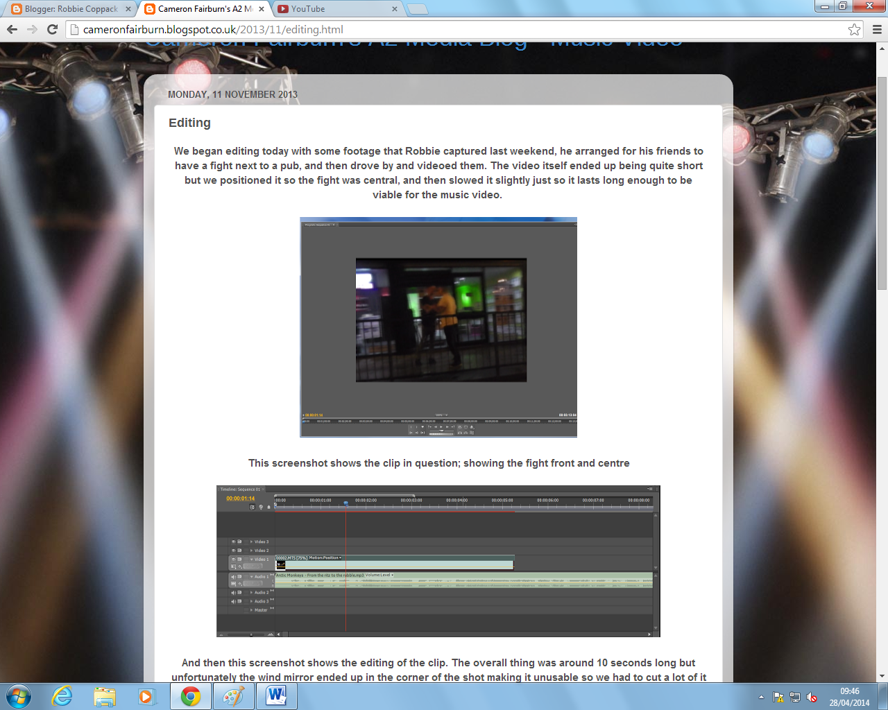 We have a blog to keep a dairy on the development of our music video. We looked at other students blogs to help us create a template for our blog. Overall Blogger worked very well, however it wasn't the most user friendly program in the world, for example, putting images on your blog posts was just infuriating as they wouldn't move where you wanted them to.

Blogger did prove to be useful, obviously providing evidence to our music video to show our roles within the group. We also used our blogs to receive feedback on any work we have done from our friends and tutor. The album cover for example. We posted the drafts, and received feedback on how it can be improved significantly. As you can see you see from our first draft to the final draft, there has been a huge change on how it looks. As you can see, we added colour to the final draft by using colour pass
Facebook/Twitter
 We used social media throughout the production of the music video, we would use social media to arrange times to meet at locations for filming etc. Instant messaging we used a large part of the time, especially when we were arranging the bouncer shots, we had to arrange who was being picked up etc. We also used this technology to say whether anything came up and say whether or not we could make it to a meeting or to a lesson.
YouTube
We used this technology to research professional music videos and other media coursework as examples to help us create and develop a concept for our music video, e.g. cutting rates, generic conventions etc.
Blogger
We have a blog to keep a dairy on the development of our music video. We looked at other students blogs to help us create a template for our blog. Overall Blogger worked very well, however it wasn't the most user friendly program in the world, for example, putting images on your blog posts was just infuriating as they wouldn't move where you wanted them to.Blogger did prove to be useful, obviously providing evidence to our music video to show our roles within the group. We also used our blogs to receive feedback on any work we have done from our friends and tutor. The album cover for example. We posted the drafts, and received feedback on how it can be improved significantly. As you can see you see from our first draft to the final draft, there has been a huge change on how it looks. As you can see, we added colour to the final draft by using colour pass
 |
| 1st draft |
 |
| final draft |
Thursday, 16 January 2014
Question 3- What have you learnt from your audience feedback?
To give us an idea of how good our video is, we had to post our video on YouTube and on social media sites such as Facebook. Our friends would then have an opportunity to watch the video and give us feedback on what we could have done better.
 YouTube
 Facebook
YouTube
Judging from the comments we received on YouTube, the video was slightly out of sync and perhaps was a little bit boring due to it being black and white throughout. Its worth noting that the video is out of sync mainly because of YouTube, its totally out of our hands. We have tried to sort it on the final draft.
The other comments from James and Stephen do agree with Matty Neary comment in regards of it being out of sync. However, the comments are quite complementary. This was possibly the best feedback we wanted, they point out the positives and negatives, which we initially wanted.
Facebook
I later posted our video on Facebook to try and get more feedback. We received 13 likes which is okay for me. Only two people left comments which is slightly disappointing, however the comments were again very positive.
I have taken into account that the Facebook views, likes and comments are from friends, which could potentially they're quite biased.
Wednesday, 15 January 2014
Question 2- How effective is the combination of your main product and ancillary texts.
The combination between our main product and other aspects of media such as the album cover design made our project have a professional outlook and the image of a brand new upcoming band.
The Album Cover

 To create and develop the album digipack we used Adobe Photoshop to make our album cover, we used various different filters and other colours to make our cover stand out. Obviously we had to look at over conventions of Brit Indie CD covers to make sure it fits in with the stereotype. We took a lot of inspiration from Blur's "Best Of" album to help create and develop the CD artwork we wanted. In terms of the album title, we did struggle as the idea banded about were limited and somewhat poor. The draft title we had was "The Four Queens" which was a terrible name. The title "Technicolour" on the other hand we all like. It an ironic title when you consider how we shot our "Ritz to the Rubble" music video.
The Music Video
 As I briefly mentioned, the music video we shot was all in black and white. We initially got this idea from researching various indie music videos and we took a bit of inspiration from Oasis' video "Wonderwall" which is also shot in black and white. Our video is completely black and white compared to the album cover we made which is colourful, we did this because we didn't want the band to have a dark image.
The Blog
The idea of the blog is to show the progress of our A2 coursework, we publish posts of ideas, research, developments, filming, schedules, editing etc. As for a real band, this would be a beneficial way to keep interactive with their fans. With limited interaction between the band and the fans, it could lead in the fans becoming frustrated and losing interactions.
Target Audience
I wouldn't really say that we target a specific audience as I feel we can appeal a variety of ages. However, I feel the majority of our target audience would be 16-30 years old. I also believe that the majority of our fans would also be British.
The Album Cover
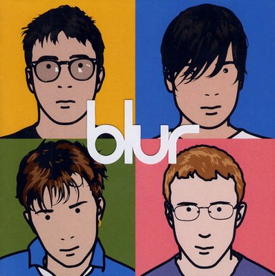
 To create and develop the album digipack we used Adobe Photoshop to make our album cover, we used various different filters and other colours to make our cover stand out. Obviously we had to look at over conventions of Brit Indie CD covers to make sure it fits in with the stereotype. We took a lot of inspiration from Blur's "Best Of" album to help create and develop the CD artwork we wanted. In terms of the album title, we did struggle as the idea banded about were limited and somewhat poor. The draft title we had was "The Four Queens" which was a terrible name. The title "Technicolour" on the other hand we all like. It an ironic title when you consider how we shot our "Ritz to the Rubble" music video.
The Music Video
 As I briefly mentioned, the music video we shot was all in black and white. We initially got this idea from researching various indie music videos and we took a bit of inspiration from Oasis' video "Wonderwall" which is also shot in black and white. Our video is completely black and white compared to the album cover we made which is colourful, we did this because we didn't want the band to have a dark image.
The Blog
The idea of the blog is to show the progress of our A2 coursework, we publish posts of ideas, research, developments, filming, schedules, editing etc. As for a real band, this would be a beneficial way to keep interactive with their fans. With limited interaction between the band and the fans, it could lead in the fans becoming frustrated and losing interactions.
Target Audience
I wouldn't really say that we target a specific audience as I feel we can appeal a variety of ages. However, I feel the majority of our target audience would be 16-30 years old. I also believe that the majority of our fans would also be British.
Thursday, 9 January 2014
Question 1: In what ways does your media product use, develop orchallenge forms and conventions of real media products?
 When we came up with the initial idea to do a "Brit Indie" music genre, we researched certain aspects of the genre and developed ideas which we felt would be a realistic concept towards our chosen genre. As we continued to work on our ideas, certain questions are asked amongst the group suggesting which is the best idea to show off a new, upcoming band. Obviously as a new band needs to get their image across to a potential audience it needs to show off the band members. So with this in mind, we looked at other bands within the genre. The Arctic Monkeys for example was a band which we continuously researched and tried to find out why they have become so successful. How did they get their image across? What aspects of the Brit Indie genre have they used? etc.
 Another band we also largely looked in to was "Blur". We came across their greatest hits album and we really liked their album cover for it. So we tried to do an album cover similar. As you can see, there isnt much comparison between the two album covers. Both have mug shot close up photographs, plenty of colour which makes it stand out, and they are both very basic. I feel a basic artwork can be a better idea than having something which can be over the top in terms of trying to get a cover to stand out.
In an overall point of view, we certainly found a lot of bands very aspiring from real media products, as a group I feel we are happy with our product, we feel it fits in with the genre we researched.
MUSIC VIDEO
I feel that researching various music videos from other Brit Indie bands has helped us greatly when it came to shooting our video, we have taken into account various editing techniques which we have used to help us make our video better.
When it comes to various media conventions regarding music videos, we used the conventions such as black and white filters which are original in this form of genre. An example being "U R Mine" by the Arctic Monkeys, the video does use a black and white filters like ours.

Subscribe to:
Posts (Atom)